
Tap Cards
An app that allows users to make instantaneous connections without being forgettable.
The Idea
Tap Cards originated from the struggle of giving out social media platforms in a crowded venue - be it a party or a mixer, we wanted to make it easier for people to take the first step in networking without the hassle. Business cards seemed too analog, and we eventually settled on NFC technology as a substitute.
The Plan
We were given 10 weeks to make our idea ready for the market. We had to strategize a game plan for marketing, create a prototype, conduct our user research and launch a start-up in that timeframe.
The Goal
Since we only had 10 weeks, we wanted to dedicate as much time as we could to each section without losing out on any key points. We split our timeframe up into 5 sections, each with a different goal in mind to help keep us in check while also being on track to finish.
Research
We conducted some initial research into our market and our competitors to better understand what challenges we would face and how to set ourselves apart.
Our Product
We began with finding which niche in the market we wanted to fill. For TapCards, this came down to digitalizing an already dying form of networking, business cards. With this decision, we wanted to take a closer look at the current state of business card products and sales by surveying our local student body to give more insight into our product.


Our Competition
We created a Competitive Analysis Matrix that listed our top competitors and compared and contrasted their most important characteristics.

Our Personas
Finally, we created 3 personas we could use as a baseline for our prototypes. We selected our 3 biggest user groups as an inspiration: students who want to collect socially, businessmen who want to network commercially, and recruiters who want to find the best candidates efficiently.


Prototyping
After completing our research and developing personas, we were reading to start with our low-fidelity prototype.
Sketches
Before we could start on the low-fidelity Prototype, we wanted to create some sketches to get a rough idea of what the UI would look like.


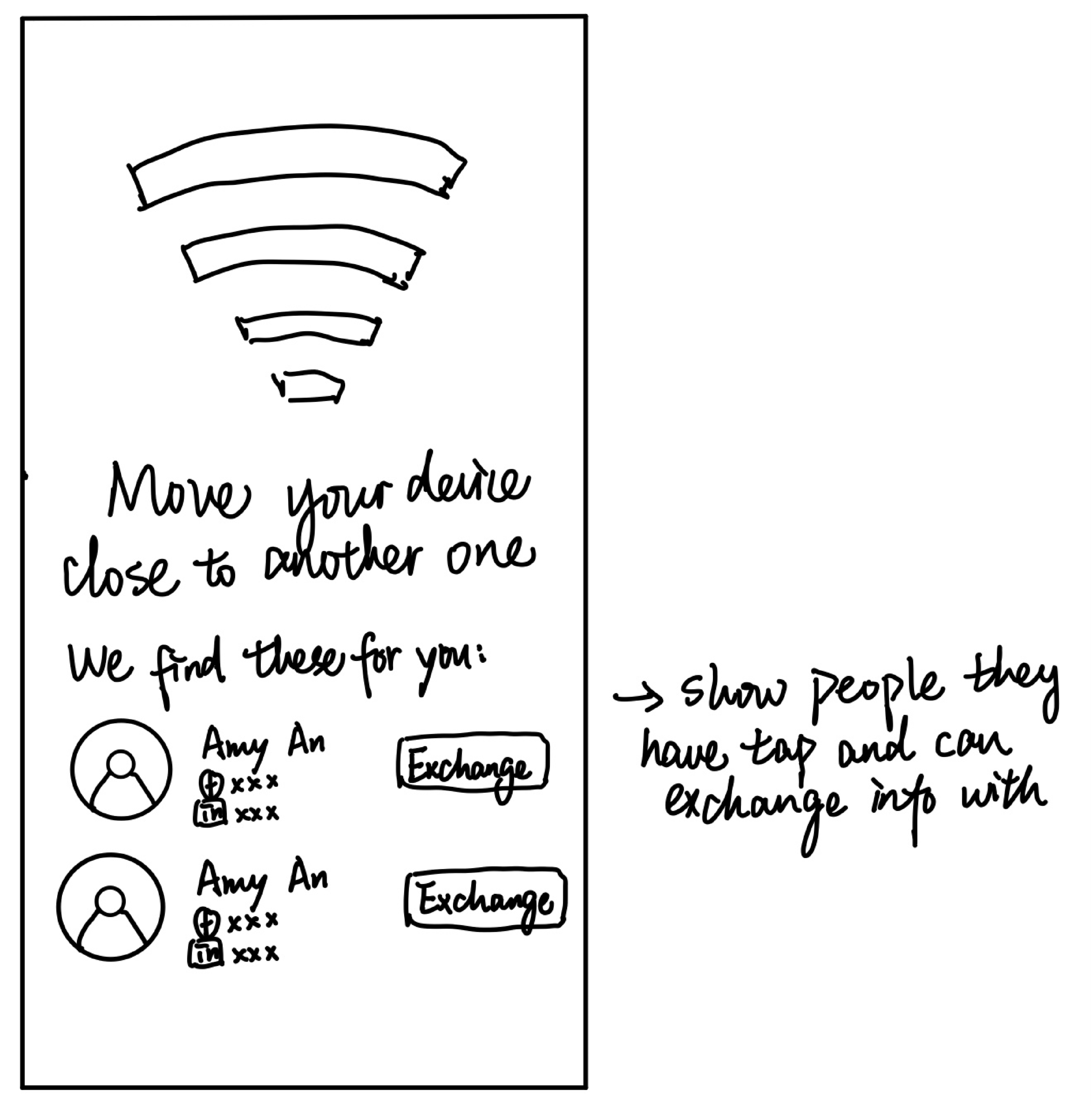


Low-Fidelity Prototype
Thanks to our sketches, we knew what type of UI aesthetic we were aiming for, and recreated that in Figma.

Interviews & Protoype Testing
We wanted to gain more insight into how users responded to our prototype along with how they reacted to the idea of virtual business cards.
We had interviewees come in person with a phone open with the low-fi prototype and ran them through the basic flow we had of adding a new card and monitoring their progress. We also kept an eye out for any serious violation of Nielson's Heuristics, just to ensure the UX experience was also up to standard.
On the right you can see some of the key changes we implemented from our testing and user feedback.
The “generate” button gets covered up on the customization page
Add an option to hide your card from others when you don’t want to be seen
Have the ability to favorite cards if you’re receiving a lot of cards
Have a space to comment on where you received a card and leave info to remember traits about the person you exchanged with (perhaps add tags or be able to comment on exchanges)
Journey Map
We also wanted to get further insight into what exactly our users were planning on doing with our app.
We decided to user journey maps to help gain insight into what we should be focusing on in terms of user goals and experience.


High-Fidelity
Finally, we moved on to a high-fidelity prototype. We used feedback from our interviews and journey maps to hone in on the usability and aesthetic of our product.


Launch
Now that our prototype was tested and ready, we decided to move on into the launch phase.
Here we expanded by creating a website with a landing page to help users find more information about us and also to help market our product.


Closing Thoughts
This project was one that took an immense amount of time and dedication, and one that came with many challenges along the way. In the end, we were satisfied by the progress we made and how users reacted to our end product. However, there some things we missed and areas to improve on.
What we did right:
We had great traffic towards our landing page through Instagram
That was with data only up to Jan 3rd, we are expecting to get more visits in the coming days.
The app’s concept and minimalistic design were gaining positive feedback.
What we could do better:
Refine the overall look and feel of the prototypes determine the features we want to prioritize, and focus on those specifically.
Add more testing and interviews in-between the prototype stages to gain more feedback about UX specifically.